Shoot Analysis (Selected Pictures)
I'm now left with good pictures I would be comfortable using for my magazine. However, I have to be selective and pick the ones which would best match the themes and colour palette of my magazine.
Here are the ones I've considered using.
This picture has a great figure to shadow ratio as I wanted and is a mid long shot according to my planning. I feel this amongst other shots may be able to portray the narrative I'm trying to tell.
I really like this picture. Appropriate codes such as the mic is present. The model looks serious and striking and the red flare only works to increases the dramaticness of the picture. I might use this as a secondary image if it blends well with the theme.
I really liked the lighting and framing of this picture. I plan to use it as my anchoring image. It will meld in perfectly with the black background of the double spread.
I'm considering using this picture in my page of contents since it's radiant and definitively different from the dark palette and theme of the cover, presenting a pleasant contrast.
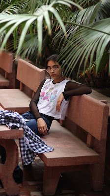
The picture is a good candidate for a secondary image as it's different from the primary setting, the stage, giving it a more informal look. The picture maintains her chic look while also adopting a more casual appearance.
This too, would make a great secondary image, the purple glare will contrast well with the rainbow in the background of the double spread.


Comments
Post a Comment