Refined Content Page

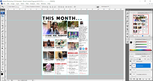
Despite being done with the content page, I decided it wouldn't hurt to look over it and see what can be done to spazz things up a bit. Once I looked it over I decided that despite the colourful pictures it looked a little bland so I made a few improvements.

I thought it would be better to introduce a little more uniformity and so I made the first three columns equal in size.


Naturally, the next step was to adjust all the elements on the content page accordingly. I did this with the help of the transformation tool (Ctrl T).


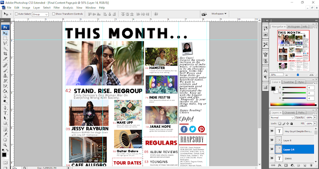
I felt my content page could be improved with a splash of colour so I used the rectangle tool to make a long red rectangle in accordance with the magazine's colour scheme, the size of the right most column. I dragged this layer under all the others. I removed the ellipses from the heading of the content page and turned all the textual elements white so they would stand out against the red background.


Finally, I adjusted all the elements on the right most column. I moved the editor's picture higher up, next to the heading. Similarly everything else was moved up and the text boxes for the note, contact information and credits was made longer but narrower to provide appropriate spacing. 


Here's the improved version:


Comments

Popular posts from this blog

Naming My Final Magazine Today's class tested more than what I've learnt so far since the beginning of A levels. It tested my patience, my will power and I finally started thinking of MIGRAIN(E) as more than a fun acronym as i spent a numb-skullingly long time just thinking, what exactly would be the perfect name for my final magazine. What seems to be the easiest task in the process of planning and designing a a magazine, took me a very long time to shortlist five names I'd actually be happy with having on my magazine cover since I want everything to be perfect. After much brainstorming, I finally decided on a name that to me seemed both beautiful and matched the image and genre i chose for my final task, Rhapsody
Magazine Double Spread Analysis After slaving for days, I have at long last, completed the last of my assignments, the double spread analysis.The double spreads are one of if not the most important element of a good magazine. The double spreads contain the actual contents of the magazine that have been teased and hinted at in the cover and content pages. Like any good mystery, it is important that the enigma is solved with a satisfying explanation (in this case, the article). I have chosen three very contemporary double spreads to understand how a successful double spread can be created and the exact impact of every element that goes into making it. Double Spread Analysis #1 Double Spread Analysis #2 Double Spread Analysis #3 Interestingly enough, the subjects of some of these double spreads ended up introducing me to new media products that I discovered I enjoy. I write this blog post while head banging to Ecca Vandal's 'Future Heroine'. My favourite part
Key Media Concepts "What we learn with pleasure, we never forget." Today's class was an exciting mix of future prospects and facts. We learned about key media concepts through a very interesting mnemonic 'MIGRAIN', which will perhaps later act as a Freudian slip!  What are key media concepts you may ask. They're the basic components used by media creators to communicate to their audience and perfectly project their thoughts within their art or more technically known as their media product.  M   edia forms and language I     nstitutions G  enre R   epresentation A  udience I   deaology N  arrative Media forms and language, to put it simply, are the way of doing things when it comes to the makings of an media product, print or otherwise. Media forms are the various different platforms on which media is produced, for example, film or radio.  Media languages encapsulate media codes and conventions. There are two types of media