Refined Double Spread
Looking back at my double spread, I wanted to make a few refinements here and there.
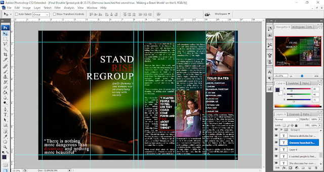
I decided to move the picture in the middle column and the attached quote a little upwards to break the monotony of the text in the upper left corner of the right page. Similarly I decided to move the second secondary image and tour dates upwards as well. I also decided to decrease the size of the tour dates. I did this by utilising the transformation tool (Ctrl T). I then readjusted the text boxes which contained the body copy to fit around these elements. I also added more distinct spacing between the paragraphs of the body copy and added text where and if it was needed.
I also decided to add the magazine name and the issue date in the footer on the bottom left corner in red with the help of the text tool in the same size as the number to maintain uniformity.
I'm pleased with my double spread which after refinements, looks like this:


Comments
Post a Comment