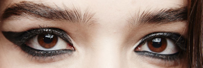
Concept and References for Cover Photo

Lighting

I plan to use low key lighting as a symbol of the figurative darkness our generation is plunged in. The lighting is going to be be hitting the subject being photographed from the front, angled a bit high.


Camera Shots and Angles

Not so uncommon in an indie music magazine are mid long shots on the cover picture and that's exactly what I'm going to be applying to mine. I'm going to be shooting these pictures using the eye level angle, representing that we all stand equal in accordance to the message of the artist.


Make Up

I want to eye make up to be heavy while the lip make up is light. The former being based in dark colours, so it stands out in the low key lighting and the monochrome colour scheme and creates an even better contrast to the splash of colour I plan to add.


Expressions

I want my model's face to be serious but not somber as to represent the seriousness of the issues they talks about through their music and to show that they understand the responsibility which comes with being an icon for socio-political revival in youth.


Comments

Popular posts from this blog

"The Beginning is Always Today" Forlorn, a girl stares out the window, unseeing. This world bores her. So she makes a new one. And then another. And another. And another. And another. That girl is me. Today marks the birth and creation of my blog which's purpose is to keep a record of the progress I've made on my foundation portfolio. Being seventeen and deeply intoxicated with the art of story telling and sharing said stories with the masses through a medium which brings us all together, taking Media Studies in my A levels was a natural choice.  Along with Psychology, Literature in English and History, it evolves my understanding of people and aids me in my aspiration of telling an exciting tale; mine. I look forward to telling you more about my project as it progresses and myself.  Keep reading!
Refined Content Page Despite being done with the content page, I decided it wouldn't hurt to look over it and see what can be done to spazz things up a bit. Once I looked it over I decided that despite the colourful pictures it looked a little bland so I made a few improvements. I thought it would be better to introduce a little more uniformity and so I made the first three columns equal in size. Naturally, the next step was to adjust all the elements on the content page accordingly. I did this with the help of the transformation tool (Ctrl T). I felt my content page could be improved with a splash of colour so I used the rectangle tool to make a long red rectangle in accordance with the magazine's colour scheme, the size of the right most column. I dragged this layer under all the others. I removed the ellipses from the heading of the content page and turned all the textual elements white so they would stand out against the red background. Fin...
Key Media Concepts "What we learn with pleasure, we never forget." Today's class was an exciting mix of future prospects and facts. We learned about key media concepts through a very interesting mnemonic 'MIGRAIN', which will perhaps later act as a Freudian slip!  What are key media concepts you may ask. They're the basic components used by media creators to communicate to their audience and perfectly project their thoughts within their art or more technically known as their media product.  M   edia forms and language I     nstitutions G  enre R   epresentation A  udience I   deaology N  arrative Media forms and language, to put it simply, are the way of doing things when it comes to the makings of an media product, print or otherwise. Media forms are the various different platforms on which media is produced, for example, film or radio.  Media languages encapsulate media codes and conventions. T...