Preliminary Exercise: Content Page
It's only natural that once we're done with the magazine cover we should design a content page for it and that's exactly what we've done! First I decided to plan out the allocation of space I wanted to give to each element of the content page I wanted to incorporate.

Since the content page belongs to the same magazine the magazine cover does, I took the same measurements and settings for the content page, creating a new file.

Having already decided the allocation of the various elements of a content, I started drawing my grid with the help of the ruler tool. I started off with two margins for neatness, a line indicating the space for the title and then divided the page into three different columns which will later hold all the contents of the content page.

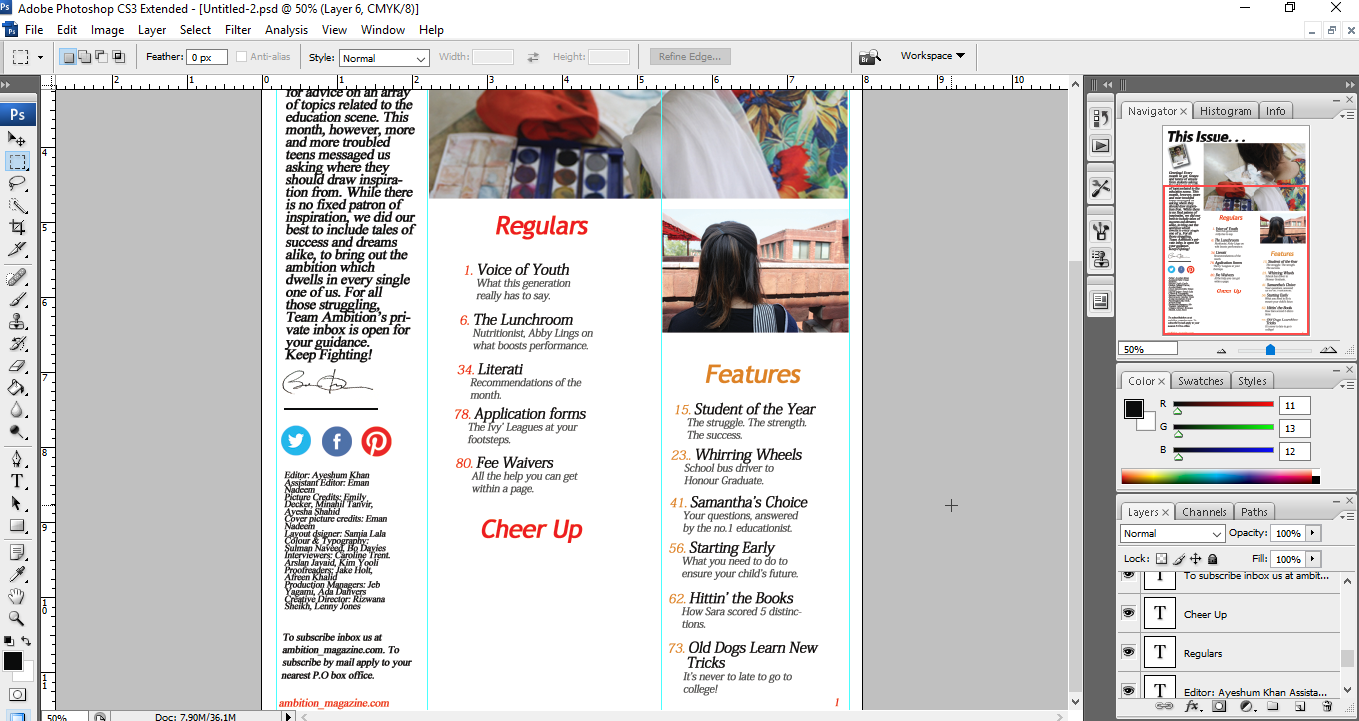
Next I decided to add a hook as a heading rather than the conventional heading of 'Contents' to make it more intriguing. I chose 'This Issue...' because it perfectly indicates that this page is going to show what this issue pertains and the ellipses is a good cue for the reader to look at the rest of the page. It is pertinent that the heading is the first thing the reader notices so they understand it's a content page which is why the font is the largest on the page, bold and in a bold colour: black.

Then I decided to add some artistic elements to the page by adding two carefully selected pictures I photographed for my earlier photography assignments (see Photography:Shots, Rules and Angles). These matched the genre of my magazine. I decided to place the over the shoulder shot as it showcased the work of a student in a not so cliched subject, art. To make it more interesting I enlarged the picture using the transformation tool so it would take up two columns juxtaposed to the second picture which only took one.

After that I decided to design my editor's note. I adjusted a picture of my friend, Ayesham, which I had taken earlier that day onto a Polaroid frame I found on the internet. Locking the layers I moved it to the main file and added a drop shadow effect to it so the readers can easily distinguish between the Polaroid and content page and to add a three dimensional effect. The picture I took was purposely against the backdrop of a shelf of books to match the genre of the the magazine. The dress code (a soft cream sweater) also compliments the genre.

I decided to add 'Editor' on the base of the Polaroid in a hand written script to make it look authentic and to guide the readers before they read the actual note that this is the editor's note. I rotated it according to how I rotated the Polaroid (to stand out against the page and make it more interesting).

Next I typed out the actual Editor's note, relating to the troubles of teens while referencing various articles and adding reasons for some of the contents of the magazine. I drizzled it with exclamation marks and kept my tone colloquial to match a conventional editor's note. At the end I added a transparent signature to make it look just slightly more official.

To differentiate it from my next element and neaten it up I drew a thick black line to match the heading with the rectangle tool.

I decided to add social media icons to signify what social media platforms the magazine could be found in rather than making a list of links which would make the content page look messy.

The next step I took was writing out the credits in clear categories, adding made up names of different origins to increase representation and diversity of ethnic groups (South Asian, Korean, German). I decided to decrease the font size significantly so it wouldn't steal away attention from the important and primary elements of the content page.

I continued by adjusting a subscription offer under the credits with enough space to differentiate between the two bodies of text. I also used a smaller font for this as it is information a reader would not be looking for at first glance like the magazine's email address. This inspired me to add the email address to the footer on the left side in red in accordance to the colour scheme of the magazine. I added the page number in red on the right bottom corner.

Afterwards I started working on the features section of the magazine. To make it stand out from the other sections I changed the colour of the section heading and it's numbers in the second colour part of the colour scheme, a light mustard. I used a sam serfic font for the sections to aid the teen casual look. I decided to make the article heading in black and a bit larger than the numbers next to it so it stands out and the numbers don't overpower the article headings. I decided to do the descriptions in grey in accordance to the colour palette I chose. In accordance to convention, the descriptions had a significantly smaller font size, never more than two lines. The first feature article I added under this section was that of the main cover line. I decided that I would number all the articles chronologically under each section.

Instead of repeating this entire process, I copied the main cover line article details by pressing Alt and dragging them after grouping the layers together. I then proceeded to alter the titles, descriptions and numbers accordingly.

Following my progress, I started on the second section, 'Regulars', which I coloured red to match the colour palette of the magazine.

Once more making a copy of the initial grouped details of the first feature, I dragged and adjusted it under the section heading, changing the appropriate details and changing the colour of the numbers to red in accordance to match the section heading and colour palette.

After this I made copies of this article information which I grouped together and continued to place them and edit them accordingly.

I then added the third and final section of the content page, 'Cheer Up', playing the role of the optimist and pertaining the light hearted content some casual readers might want to access quickly. I used red in accordance to the colour palette.
Making more copies of the 'Voice of Youth' article information, I dragged them under this section and edited them in accordance to the section, editing everything from the page numbers to the descriptions.

And the fruit of my hard work...

Comments
Post a Comment